


![MacBook Pro M5: All the features and specs you need to know [LEAKS REVEALED]](https://tomsreviewbox.com/uploads/images/202502/image_430x256_67bd6d7cd7562.jpg)


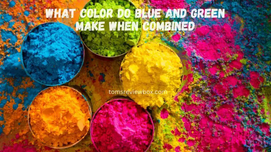
What Color Do Blue and Green Make When Combined?
Discover what colors blue and green make when combined, and explore unique shades and tips for your creative projects!
Key Takeaways
-
Combine blue and green to produce beautiful colors such as teal, aqua, and cyan. Find out how these beautiful colors will take your art and design projects to the next level! Try out various ratios to unlock the creative powers hidden within each of them.
-
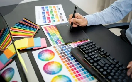
Knowing the basics, including what makes primary and secondary colors, is essential to producing the right shades. Understanding how this functions will equip you to create the most impactful work and make the smartest decisions in all of your creative projects.
-
The quality of pigments and even the medium you’re applying it with can greatly affect the color you end up with. Consider these elements to improve your color precision.
-
When using blue-green hues in your designs, think about how the hue, saturation, and brightness will play into the overall look. Balancing these elements is the key to making compositions that catch the eye.
-
Shades of blue and green are soothing to the eye and have been shown to produce powerful feelings. They possess cultural values too, encouraging more peaceful and balanced emotions. Take this understanding of colors and colors’ meanings to better resonate with your audience.
-
To make your designs accessible to all audiences, use colors that work well together and keep an eye on their contrast ratios. By adopting this practice, you’ll create inclusive, engaging work that reaches all users.
Our favorite combination is blue and green, which makes the really beautiful tone of teal. This iconic color pattern blends the tranquility of blue with the vibrancy of green. The outcome is a multi-faceted hue that instantly enlivens any environment.
Teal is known for invoking a sense of calm and creativity, which is why it’s widely used in different designs and style fashions. Whether you’re painting a new bedroom or picking out a new outfit, teal will make your space—and wardrobe—feel fresh and sophisticated.
In this post, we’ll explore the wide variety of shades produced when these colors combine. I’ll even give you suggestions as to how you can use teal in your life to make the most of it.
Find out how this vivid hue can get your creative juices flowing and liven up your space.
What Colors Result from Mixing Blue and Green?
Mixing blue and green paint creates a vivid array of colors, resulting in variations like teal and aqua. Understanding this color combination enhances your artistic endeavors and design decisions, empowering you to use complementary colors more intentionally.
1. Understanding the Color Mixing Process
Blue and green are secondary colors, created by combining the primary colors. When you mix them, the proportions make a big difference. Mixing equal amounts of blue and green will give you teal.
However, if you add more blue, you’ll get a darker version of cyan.
2. Factors Influencing the Outcome
While there are many variables that influence what color you will end up with, the quality of the pigment makes a difference. Producing the best results usually requires high-quality paints that yield deep tones.
Even the medium—whether you’re working in traditional paint or digitally—can change the combination. Additionally, lighting conditions play a big part in how we perceive these colors, creating colors that appear very differently in different lighting.
3. Differences Between Subtractive and Additive Mixing
In subtractive mixing, like with paints, blue and green mix together to make cyan. Additive mixing, which is used in digital mediums, is in contrast to this and involves light.
As shown here, blue and green light mixed together can create very bright combinations but can look very different than their pigment mixtures.
4. Role of Hue, Saturation, and Brightness
Hue is a major factor in how we perceive the resulting mixed colors. The saturation level plays a factor in how vibrant the shades are. More saturated shades are more intense.
Brightness changes the perception of the whole color, affecting how the color looks in a room.
5. Variations in Pigment Quality and Digital Profiles
Mixing different pigment characteristics, such as primary colors and secondary colors, results in many colors. Since physical and digital profiles are very different, accurate color reproduction is critical to a successful design project.
Shades of Blue-Green
Blue-green shades are incredibly enchanting. Tapping into the calming, peaceful influence of blue tied to the restorative, revitalizing qualities of nature, blue-greens have a rare richness. That potent brew of emotions and associations makes it a color that translates stunningly in almost any design application, from interiors to web design.
The versatility of blue-green allows it to evoke diverse emotions, whether you're aiming for tranquility or vibrancy in your space.
1. Common Shades Produced
-
Teal: A deeper, more subdued shade that brings the ocean's depth into any design.
-
Turquoise: A bright, tropical hue that captures the essence of clear waters, hex code #40E0D0.
These colors, including complementary colors and various shades like light green and mint green, have seen a major resurgence in contemporary design.
2. Creating Lighter and Darker Variants
Making lighter shades is even easier — just mix in some white with your blue-green base. To make your darker tones, mix in black a little at a time until you have the level you want to achieve.
These variants are perfect for eye-catching or subtle all-over enhancements, creating a beautiful contrast that evoke feelings ranging from light and airy to rich and multifaceted.
3. Examples of Blue-Green Shades
-
Turquoise (#40E0D0): Often found in coastal themes.
-
Teal (#069494): Perfect for modern interiors.
These shades are popular both on land and sea, as they’re commonly found in tropical waters and lush tropical vegetation. Artists such as Leonardo da Vinci and Titian often employed blue-green to infuse their creations with depth and serenity.
This technique underscores this color’s timeless beauty.
Significance of Blue-Green Colors
Blue-green colors, like indigo, prevalent in the natural world, bear rich psychological and cultural significance. These colors bring peace and serenity to mind, which makes them perfect choices for producing relaxing spaces. Think about how an image of a tropical beach with those clear blue-green waters immediately calms your brain, showcasing the beauty of a color combination that resonates with tranquility.
In art, the soothing influence of blue-green glows from great works by Leonardo da Vinci and Raphael. Their thoughtful mixing of colors deepens the picture and the spell. Teal, a deeper hue of blue-green, portrays richness and vitality, attracting those who want an aspirational look, perfectly reflecting the essence of a green paint color.
Culturally, blue-green holds importance in various cultures around the world. In numerous native cultures, these colors represent peace and equilibrium. They should guide design decisions in textiles, interior architecture, and beyond, especially when considering the impact of complementary colors.
They’re extremely versatile, working beautifully in contemporary settings or more classic ones. This versatility makes them an essential tool for effective branding and marketing campaigns. The refreshing blue-green color portrays their focus on trust and renewal, perfectly hooking consumers in.
Throughout history, blue-green pigments have influenced the direction of art and design. Iconic masterpieces by Titian and Vermeer illustrate how these colors evoke a sense of calm and rejuvenation, transforming the viewer’s experience with their unique shade.
Whatever else comes and goes in design trends, blue-green is sure to be a go-to color for more beautiful, nurturing contemporary spaces. In sustainable design practices, these colors mirror the beauty of nature, further connecting designs to eco-friendly ideals.
Effective Use of Blue-Green in Design
Blue-green is an arresting color, lounging somewhere between calming and dynamic, which makes it a useful color in design. When you want color harmony, blue-green can achieve a cohesive feel, working nicely with monochromatic, triadic, and complimentary palettes.
Beyond creating visual interest, this color invokes feelings that resonate with viewers on a personal level. Learning how to use it effectively can take your design projects to the next level.
1. Color Combinations for Aesthetic Appeal
Effective combinations include:
-
Coral
-
Soft yellows
-
Warm neutrals
-
Dark navy
Finding balance with these things is certainly the goal. For example, applying a saturated coral color in contrast to a blue-green background will make a statement without creating a jarring experience.
Effective designs, whether coastal-themed interiors or colorful marketing materials, use these articulations to grab attention and keep a sense of balance.
2. Accessibility Considerations in Design
Making sure color is accessible for everyone is incredibly important. Providing high contrast ratios allows all viewers the opportunity to see design elements, which is crucial for individuals with visual impairments.
Aim for a contrast ratio of at least 4.5:1 for text against background colors. Inclusive designs can easily use blue-green and still be clear, making sure everyone is able to interact with your content.
3. Practical Applications in Various Mediums
In graphic design, blue-green lends a contemporary sensibility to logos and branding. In interior design, it promotes tranquil environments, ideal for unwinding.
Fashion brands often use blue-green in textiles, reflecting trends while offering versatility. These uses are incredible examples of the color’s versatility in different applications and environments.
Common Misconceptions About Blue-Green Mixing
Of all color mixing matters, mixing colors like blue and green can be the most controversial. There are lots of myths surrounding the practice of creating a green paint color by mixing blue and green. This misunderstanding can obscure their overall understanding of color theory, particularly when exploring complementary colors and color combinations.
1. Myths Surrounding the Resulting Color
Another misconception is that blue and green can’t mix to create bright, lively colors. In actuality, when blended as intended, they produce beautiful bright blue-green colors, such as turquoise and teal. Many think that whenever you mix these colors you get mud or ugly dark tones.
The reality though, is that the outcome can be very bright and vibrant as long as the right proportions are used. Change the ratios of blue and green to produce an exciting range of blue-green colors. This keeps any one color from being overly dominant while every hue has its own special beauty.
2. Clarifying Misunderstandings in Color Theory
By far the biggest misconception is the lack of understanding of color theory, specifically primary colors. What makes a primary, secondary, and tertiary color. Blue and green are not primary colors.
Mixing the two produces a majestic secondary color: blue-green. There is a large disconnect in how color mixing theories are applied with real world practice, for example when painting or designing. The more you understand these principles, the more creativity and expression you can have with your art.
Terms such as saturation and hue are incredibly important, as they allow you to communicate the qualities of the colors you mix.
Experiments and Case Studies
Knowing how blue and green paint colors work together creates a world of exciting opportunities. Through practice and experimentation with mixing colors and different blending styles, you can discover distinct color combinations and tones that really speak to the desired feeling or emotion, enhancing your palette while unlocking a more profound connection to color in your work.
1. Practical Examples of Mixing Blue and Green
The Impressionists Monet and Turner adopted blue and green to create calm atmospheres within their landscape paintings. Designers often use these colors in branding to promote calmness and trust, as seen in logos for health and wellness brands. Trying to inspire calm, interior designers have long mixed blue and green, a trend you can spot in paint and furnishings.
These illustrations are just a snapshot of the many ways blue-green mixing can be used. Monet’s water lilies show us the way these colors can absorb light to achieve depth and peace. Businesses whose branding prominently features one of these colors usually see an increase in customer interaction.
The soothing nature of these tones attracts interest and builds brand allegiance.
2. Insights from Design Projects
Whether we’re talking about blue-green or connecting Indigenous culture to the built environment, these projects have a strong story to tell. In web design, utilizing a blue-green color scheme not only increases visitor engagement but also emphasizes the importance of mixing colors effectively. It’s mesmerizing, drawing users in and maintaining their attention like nothing else.
Like any successful project, know that doing too much of either color will put the viewer on sensory overload, in which case, you lose their attention. Incorporate blue-green as an accent color to draw attention to key points of interest.
Design with subtle gradients that blend seamlessly from one color to another for depth and elegance. This fresh, eye-catching approach attracts and provokes deeper engagement, particularly in online environments, making it essential to understand the impact of complementary colors.
Conclusion
Blue and green together unlocks a world of rich color mixes that spark energy and movement in nearly any design. Whether you want to make peace and cozy environments with shades of teal or turquoise, or both, these colors will add a lively energy to your designs. Knowing the difference between these colors allows you to select the best tone for your application. It’s really just about discovery and experimentation and figuring out what works best for you. Explore the magic of color mixing and find out how mixing blue and green can inspire artistic creation. So, don’t stop there — pick up the pigment with paint or pixels and get to blending! Explore your personal aesthetic and express your imagination with these one-of-a-kind hues. So don’t hesitate, add some blue-green sparkly magic to your space or project!
Frequently Asked Questions
What colors do you get when you mix blue and green?
Mixing blue and green paint creates various shades of cyan or teal, with the specific hue depending on the color combination used.
Can you create darker shades of blue-green?
You can achieve darker, more intense shades of blue-green by mixing colors with black. For truly deep colors, consider using a darker blue paint or green paint.
Is blue-green used in design?
Given the soothing, natural, and tropical attributes associated with blue-green, a beautiful color combination, it’s no wonder this shade is highly sought after in design. It’s a versatile hue that works well in both modern and traditional environments.
What emotions do blue-green colors evoke?
Blue-green colors, such as mint green and turquoise, tend to be calming, peaceful, and refreshing. They promote creativity and productivity, akin to greenery, while enhancing the color scheme indoors.
Are there any common misconceptions about mixing blue and green?
Another misunderstanding is the assumption that mixing colors like blue and yellow paint will always create a beautiful, rich green paint color. The outcome can change dramatically depending on the color combination blended together.
How can I experiment with blue-green colors?
Experiment with different ratios of blue and green paints, focusing on mixing colors to find the perfect shade. Pay attention to the differences, and you’ll discover just the right hue for your application.
Where is blue-green commonly used?
Blue-green, a fantastic color combination in design, branding, and fine art, showcases its versatility across many colors and applications.
What's Your Reaction?